Responsive Web Design
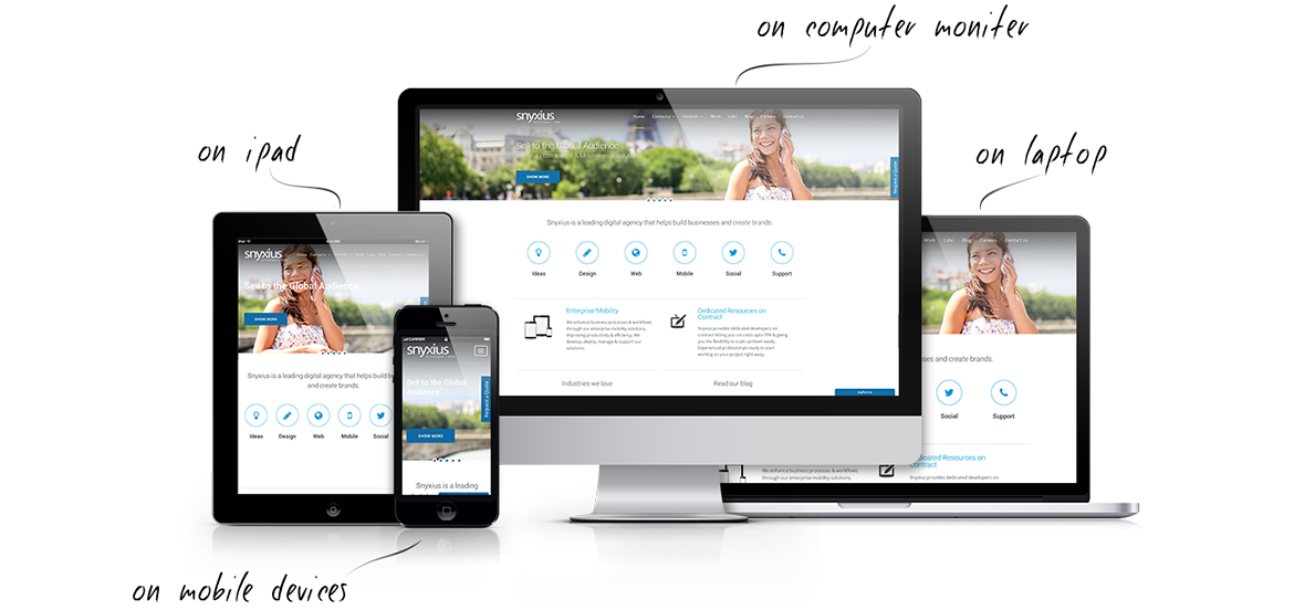
Responsive Website Design – The website uses the same URL on all devices. The website serves the same content to any device but will change the view and order depending on the size of the device. In other words, it rearranges the content to fit onto any screen size. Responsive design is client-side rendering. This means the browser will have to download the entire web page, then resize it according to the screen size. Adaptive Website Design – The website uses the same URL on all devices. The server (where the website is hosted) detects the device whether it is a mobile phone, tablet, or desktop, and will load the version of the site that is optimized for that device. In other words, only mobile-optimized assets are downloaded. This method is the server-side approach, because all the work is done by the servers before it even reaches the client.
Benifits
- One URL makes it easy for users to interact with the website.
- If built properly, responsive design automatically adjusts to whatever device the user is using.
- When making changes to your site, you only have to make those changes in one place instead of two if you have a separate mobile website.
- You will have to change your entire existing website.
- Cost. Because responsive design can be tricky, and there is more to building it, it will cost more.